Showing posts with label GMH. Show all posts

GMH - Sound

One of the things GMH really wanted when they contracted these films was that they be playable without sound so that being worried about listening to an information video on your sexual health in a public place wouldn't put you off. I kept this in mind the entire way through the creation of this film. It was a huge driving force in why the film was narrated through speech bubbles and mathematics. I wanted to make sure that at no point was sound absolutely crucial.

Of course I wanted sound there however. I wanted you to have the option. Setting it in a club gave me a huge direction to steer in when it came to sound because I obviously needed club music.

I think I thought a bit too hard about this part because I was over complicating it. I was going to have muffled club music and have it dip in volume when the maths came up and then there were going to be popping and pinging noises when the bubbles came up and by the time it came to looking for the track to use as the music I really didn't want any more than just the track. After all they are in a club so you wouldn't hear anything else.

I had this idea for the music in my head too. This whole film was inspired by games and how game characters typically talked to each other or expressed things in their games. Which was through speech bubbles. The character design is also heavily influenced by the characters from dumb ways too die which is a popular mobile app game. So I thought that if I could help it I would like to keep the track feeling old fashioned game play or menu music.

I ended up picking three tracks from kevin MacLeod that I really liked. (Seriously do we use anyone else?!) and all three of them fitted to the film really well. I had quite a hard time picking actually because there was something very fitting about all three of them. However in the end practicality won over and I picked the track that allowed me to focus more on what was happening when I was watching. When I was listening to overcast I didn't think it was as overpowering as the others and i just thought they sat together far better than who likes to party or disco con tutti did.

Here are links to the other two tracks I liked but didn't use


So that was it, the last big decision I had to make for this film. I recently found that Waverly Care is right round the corner from my house and I can pop in to talk to them some time soon about these films. Which means hopefully it won't be too long till I can put a brand on the end and hand them over to them. Which is very exciting because I'd like for them to have them.

But that's it! GMH all done and dusted!


GMH - Animating

Lets talk about animating! God did the animating for this take a long time! I could not believe it! I kept putting off doing it because when I was doing it, it took ages and I felt like I was getting no where.

The really unusual thing about taking all year to animate this was the countless times I wanted to go back and change something because I had decided I wanted to push that scene a bit further, push the acting a bit further or had learnt something in the later part of the year that would have really helped me when I was animating earlier. Honestly that happened so freaking often that I couldn't even tell you. I'm going to pick out a few scenes to talk about that were difficult at the time, some I've learnt about and so on.

These below two scenes I am going to talk about because I learnt things when animating them. Or there animation was just significant enough to discuss. 


This scene here I did part way along the process after I completed 10x10x16. I ended up animating the lightbulb moving just by key framing the drawing of the lightbulb in premier because it was far easier than hand drawing it all out. I really wanted this animation to be smooth and that allowed me to do that. This was definitely one of those points where I learnt something because there were so many points in my film I would have loved to have done this from the get go. I would really have loved to animate the entire thing in after effects to be honest but I didn't have that figured out at the beginning of the year. And I had really wished I'd done it after Francesca told me about the plug in they were using for their collab this semester. But hey what're you going to do. 

I've also noticed his hand got cut off in this scene and that's a little annoying... I'm sure you don't notice it when you watch it.


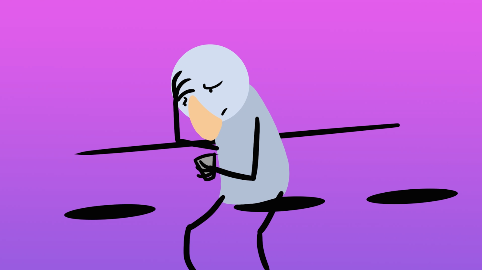
This next scene I want to talk about much earlier on in the process. I hand sketched this out when I animated it. I did this in Flash so it was rough but I could see the results really very fast. I can't imagine having done this any other way because I revised and changed this scene so many times to get the head movement right. I was really fortunate the day I animated this that I had megan in the department using the other end of desk to work because her department was a no go area for a while. Every so often I would just get her to turn her head in a disapproving manor and that real helped me perfect this movement. Now It's probably my favourite scene in the film.

These next two examples are examples of times when taking so long to make a film caused me difficulties and inconsistencies that I really notice now the film is completed. 


So all of the above images are connected to the same point I am about to make. I spent such a long time at the beginning of the year deciding on shapes and semiotics for this film (check sketchbook) to make sure nothing was confusing or misleading but I'm annoyed at myself that I didn't take that as far as to continually make sure the ?'s were consistent in the final film. I wanted to make them as bold as the rest of the mathematical elements like the ticks and the hearts which is why I thought yellow because it feels like the colour you only choose when you can't make your mind up or are trying to stay on neutral ground. Then when I put it in the whitish bubbles I noticed it wasn't too clear so I outlined it in black but now it just feels messy and inconsistent with the other yellow question marks, which all work fine. Then occasionally when they aren't part of a mathematical equation I just leave them black. That was deliberate because I didn't want them to be associated with the maths but I don't know if its even worth it or if that's just as confusing as having them yellow would have been. 

I'm not sure what to do for the best without asking a whole bunch of people seemingly nit picky and random questions about it. Which I don't really have the time nor the enthusiasm to do anymore. So I guess it'll just have to bug me a little. 


The other inconsistency that I notice is the way I've chosen to represent the bar itself in this film. When I saw this film play out in my mind way back at the conceptual stage of the process I saw only hints of the bar space they were in. It wasn't really relevant past a typical access point to these types of situations. We've already seen the dance floor and now we just needed to see the bar. And in the final film I represent it in a few different ways. I wish ultimately that I had just stuck to the first representation of it I show you. I love having it represented by a darker section of the screen. I think it's clear, I think it's stylised and I think it functions. There's really nothing else you need it to do. But That was the last incarnation of the bar I came to work on. I wonder if it really only works because of the angle it's at makes it look like we're seeing it from the top down. Which we are meant to be I just wonder if I could have made it work for the other scenes. 

In the two examples down from that I use a simple line to represent the bar because the camera is at eye hight with the bar. In one of those scenes I also add some bar stools because the character is sitting down, an element I emit from my favourite version of the bar. It's fine but every time I see that scene swing onto screen in the final animation I wish I had thought about it differently. I would at very least change the opacity of the chairs to 56% which is the opacity of the bar top in the later scene and the ground of the opening scene.

Finally the last scene where the bar is present you can see I didn't include it at all! The characters arms are bending as if they are leaning against it but I didn't put it in there at all. 

Given more time I'd like to have figured out a way to bring the later three incarnations closer to the one I liked. Ideally I would have had this figured out before I started the animating but to begin with I was up against a deadline and sometimes you can only see an issue in hindsight. 

So that's all my pros and cons of the animation process for GMH. I unfortunately can't show the animation on my blog because although the animation is finished I still didn't hear from GMH or Waverly care on which branding element they wanted from the final film and I obviously can't release it without that information. It will be in my dropbox for assessment though. But for everyone who is not one of my course leaders. You're going to have to wait. Sorry!

GMH - More Storyboarding and Some Animatics!

Ok so the last time I spoke about GMH was a really long time ago. Like seriously long. but that's because between then and now we had another meeting with gay man's health where we all caught up, animatics were shown and Alistair told us that gay man's health was becoming a part of waverly care. He said they still wanted the films but were unsure on the branding that would go at the end of the films so he was going to wait till he was sure about them before he got the films off of us. He didn't ever get back to us. So I had intended to continue to work on it and just get it finished so that they could have it when they wanted it. But other things just kept getting in the way and I just didn't want to finish it when I had so much other stuff going on. It was too much for a while and I put it off till I had more time.

That time did not come for a very long time. I kept getting more things and other deadlines approached far before I had intended. But I have finished the film so they can collect it whenever they like it. But I won't be linking it here. I will be dropping it into my dropbox for my tutors to look at and I will also be putting some pictures but for now I am going to talk about animatics!!

So I mentioned in my last post about GMH that I was going to revise the storyboard. I was really lazy with that and the revision is only different in the respect that it has a big red x through the square to be removed.  Wa - lah! Very minimal changes.


It's funny actually because I was very proud of this storyboard when I first made it and I still am, I just would have made it differently now. I know now that camera angles are directions that should be included outside of the panels. Even though within this animation there are gaps in actions while the camera pans around I still would not have had the panning angles in their own boxes. I also may have actually explained some things to myself. I think at the time though I really knew this story inside and out so I didn't need too and when I told my clients I acted it out a bit as if I was the characters. I hope that wasn't embarrassing...

Anyway that's the storyboard revision. I did a lot more revising when it got to my animatic. I took a long time to put this together so I was constantly changing things because I was always watching previous parts while making the new ones and I was asking people's opinions as I went so things kept getting changed. So here's the animatic for this film. Which again is another pretty much bang on version. I kept very close too it for the final film.


Obviously between this version and the storyboard there are very few changes. It just moves now. I also cut out this small part where we follow a character around a club and nearly see from his POV while he scans it. I really only included that because I wanted some playful cinematic ways to move through the space. I don't like it when I have to limit my camera angles to flat and static cameras because it's an animation and it makes my workload to difficult. Unfortunately on this occasion I had too much work and the only thing I could do too make sure I finished this film on time was cut some unnecessary elements out of the film. Other than allowing me to fulfil my need for fancy camera work that scene didn't give me any reason to keep it. So it got cut! 

Next to that I spent a long time on this animatic trying to make sure things played for long enough too make sure that the maths was understandable to people for the first time. This is how I ended up with quite so many people watching the animatic. I got some advice from some people on things from that process too. 

For example people were confused by the initial introduction of the hearts and ticks and maths that's curtail to the animation. It was important that people didn't get too hung up on trying to figure them out and miss what they were actually saying. To get around that I included another establishing shot of a crowded dance floor in the club, several of those on the dance floor have bubbles above their heads with hearts and ticks. So that way we know not only is this how people talk in this animation but also that this is the end game. To present these elements to one another. So that unconfused that.

Lastly I didn't change this element in the animatic because it came from the last person I showed the animatic too but I changed it in the final film for the animatic. It was pointed out to me that I use two different ways to say no in the animatic and if I want the maths to stay consistent I was going to need to take one of them away. which I did.

Then just the animation.

Gay Man's Health - Idea approval

So Not long ago we met with Gay Man's Health to discuss what they thought about our ideas and where we should go from that point.

I showed them my idea and they very much liked it. To begin with they had very few issues. They only wished for the character at the bar that had a stop sign next to him already to be removed from the film because they felt sorry for him and they didn't want the message to be if someone has HIV you shouldn't be sleeping with them because that's wrong. And I didn't realise you could look at it like that before so I agreed to remove his character because you know that's not the right vibe at all! Like I may have mentioned a thousand times before with this project Gay Man's Health are all about blatentness and one of the things included with this is an acknowledgement that if you have HIV your life is not over and as long as you are careful then no doors are closed to you. So from this point onwards I am going to be very careful to avoid singling out anyone who has HIV. Really what we are going for here is an awareness thing. Like it doesn't matter what your results are just that you know them in the first place. Gay man's health can help with things once you know what's going on but if you don't know that's when you're at risk. So I feel a little clearer on that issue now that the meeting has happened.

Slowly as the meeting progressed and we'd gone through the rest of the films we kept being drawn back to mine. Something about it wasn't right. The Alistairs began to realise that many of the same films covered similar subject matter and as they stood the films being made were overlapping each other. Which they decided were fine but in the end we decided that my film was better suited to a different more generic sexual health message rather than the current message "Get Tested' which was specifically looking at HIV. It was felt that the message I was sending was more generic and they they would have liked something more specific relating to HIV for the HIV film. After further discussion they had decided that they wanted a film that would remove the stigma surrounding HIV as people tend to only focus on the negative. While they didn't want to glorify HIV they also didn't want people who had been diagnosed with it to feel like there were huge sections of their life closed of to them. Once this decision was made it was simple enough for me to hand my initial message of "Get Tested" Over to Shannon who had yet to begin work on her final film which was the message "Go to A Clinic" Which was more of a generic sexual health message. They were pleased with this outcome because they very much liked my film and wanted to keep it if possible.

So that was that settled. I will be making some minor adjustments to my film to make it suitable to any sexual health issues and Shannon would be making a more specific HIV film.

This is about as much work as I have done on they film at the moment. My nest steps will be to revise my storyboard and take a better look at the shots I am using to tell the story and make sure I have picked the most suitable angles before I move on to the animatic.

I have informed Alistair on our operation progress from this point so he knows what to be expecting the next time we meet him. I will be emailing him a revised storyboard before I continue onto the animatic because it is easier for him to check the story is working in its basic from while it is a storyboard even if I will probably be making several animatics anyway. So that's it for gay man's health just now because of several other commitments I've had since the last meeting.

Since then I've been very busy with what actually feels like nothing but I have actually not stopped. I am completely knackered!

Gay Man's Health - The Story

So the story for my Gay Man's Health film goes as follows -

  • Men are in club
  • Two of them are talking about hooking up
  • One displays his tick alerting the other they are HIV negative
  • The other displays a ? telling the other that he doesn't know what his HIV status is.
  • The first looks concerned and displays some math that says a tick + a ? = (scribbles)
  • The first one then looks upset and asks why a tick + a ? can't = <3 
  • To which the first one flat out tells him it can't by using a stop sign
  • We then pan to the next set of characters who are having the same conversation but things are going well for them.
  • Both characters display their ticks and then a love heart appears over their head that says they are a ok to move forward.
  • panning again we join a character moving through the space scanning the area for someone he's interested in. He moves past a character who already knows his HIV status is bad and ignores him
  • And then another who has a "?" to display
  • He then passes a character sitting at the bar looking rather distraught. We then stay with this character for some time.
  • He is staring down at his phone expectantly - the phone displaying a loading style "..."
  • He then displays a very distressed scribble telling us that he thinks his night is ruined and he should maybe just go home because
  • but then an envelop appears on his screen telling him he has mail
  • He opens the mail and his demeanour changes entirely he's happier now and much more confidant. 
  • He signals to the bar man and then gestures off screen
  • We then see the man from early resting up against the opposite side of the bar.
  • A drink slides into screen with him and he accepts it gesturing a thank you to the first man
  • The first man then flashes him his tick and the second man returns it
  • They both then leave together after confirming a <3
  • The slogan "you're sexual health status is important"
  • "to both you and to others"
  • "make sure you know what it is"
  • "GMH" appears

(Storyboard)

Like I mentioned before this storyboard was born out of no where this was completely organic and I actually love so many things about it. I like that I didn't let myself think to hard about it to begin with because I feel like I captured the completely organic nature of flirting quite well. I really liked the style of the characters. They're basic level of design allows them to be very expressive. With the message of the film being very obvious as to state it at the end I feel like overly complicated characters aren't going to take a lot of unnecessary time to create and animate. They don't have to be that complicated so why make them that way?

In term of the camera shots I wanted to make this film quite stylised which is why I chose lintless characters (I think they're really soft and with the background I think it clashes less) and I picked that bright pink and purple gradient background. I love working with bold colours, it's very me. I think they grab your attention and as this film is most likely to be watched on phones and tablets then I want to make sure you can really see what is going on with the characters. So I took a screenshot of my concept art imbedded in this site to see how the characters were holding up on a device screen and here it is:

(screenshot from my phone)

Everything was entirely legible and I could see the legs and arms against the background very clearly. Which I was worried about. So that was great! I made the character blue because that's the colour that gay man's health are. So that's really it on character design just now. Sorry it's a bit all over the place haha. I was making decisions because of other influences and things so it made the narrative here a bit all over the place.

Ok so heading back to the story. I quite like it for a first storyboard. I think it got all the points down. I did spend a few days on it and it developed along the way so although it's a first storyboard it's a refined storyboard. I felt like once I had characters drawn that had expressions and real character to them, that they knew what they were doing and it was driving me. Where as before I really did have no idea what I was doing.

I think to be honest a lot of this has a boy who turned yellow influence. Jared played it to an audience of prospectus students at an open day one day early this year and it's been playing in the back of my mind ever since. I love video games, especially the quirky ones. And I felt like the boy who turned yellow had a real video game vibe about it. Plus a quirky cuteness and I think that is featuring quite highly in the development of this film. The characters are styled part way between them and the work of Jotaka who's an illustrator I really love.

(Illustrations by Jotaka)

(The boy who turned yellow - Gavin C Robinson)

I dunno what to tell you guys I love playing up the nose on my characters!

I've derailed a little bit but pulling us back to looking at the story. I feel like the ticks and the stops and the hearts are like checkpoints you need to reach in order to go all the way, like when you used to play an old crash bandicoot game and you'd jump on a checkpoint box and some confetti would go off and things. I feel like it's got that kind of vibe. Or if it doesn't yet that's something I'd like to bring to it because I want it to still feel fun. I want people who are watching it to not feel turned off by the idea of checking their partner or their own sexual health status before they can get anywhere. I can imagine it's a bit of a mood ruiner but it's import and and if I can push the point that it doesn't have to ruin your night and that it can still be fun then I think the film would have all the elements then that I want it too. That's why I like this game element in this film. It's a bit fun and reminds you that that's what this is meant to be. 

The last thing I wanted to do with this film was guilt anyone or make anyone feel scared or isolated and I feel like my chosen narrative does that.


Gay man's health - Resolving the problem

Ok so every film we're asked to make has an issue to work around. For this animation the obvious one is that I need to entice people to see get a HIV test but in addition I had to do that convincingly without sound. The last troublesome element to this project was that Alistair had asked for these to be  short 45 to 60 seconds long each and I really didn't want to make that all text so you would understand because that would leave me very little room to do anything I wanted to do. I really didn't just want to animate text because to me it seems flat and while it can be quirky and fun in places it's not really what I want to make and I don't think I could make them an animation they were happy with if I made it like that. So I had to take some time to think about how to create a narrative that didn't need text or audio in order to be understood. The difficulty with this is many other information videos such as these come with narratives over the top so I had very little reference material to draw on.

For a while I considered making it a bit like one of those weird add campaigns where you aren't entirely sure what it is that's being advertised until right at the end. Michael pointed me in the direction of an amazing music video that had the style I was going for in mind and while I considered it I began to feel that while I wanted to animate something like this at some stage it was entirely wrong for an information campaign. When really a video like that would be all about making you guess what it was for and the novelty in it being that it's clever at the end, I really don't think that it's correct when you want to encourage people to use a service. Maybe if you want them to buy a product but informing them on a service it doesn't really make for a good choice. So I quite quickly decided not to follow this route any further. Bellow is the music video Michael sent me.

(Music video - When I was Done Dying - Dan Deacon)


So once I had completely abandoned any idea I had in my head I could really get thinking about what it was this project needed to be effective. By this stage in the process I had no ideas left in my head that could sway my decision. The only thing I had left knocking around in my head was the colour pallet Laura had drawn up as a rough guide. Because we had all decided to keep things cohesive we would agree to a set of colours. Primarily blue because of the gay mans health symbol but then also other colours of the same tone as the gay mans health blue. So this was the only thing I had running through my mind at this stage of the process. And if I'm honest I think this blankness really helped me.

(Colour pallet Laura put together)


It meant that I took a step back and thought about how else we communicate information when we don't use words. So I started looking at symbolism and visual linguistics. I mean you automatically know what the little green man on the traffic lights means when you see him. So I was thinking about your typical symbolism when it struck me that this is all it needs to be. It's a campaign about safe sexual health and going to a clinic to find these things out. So I thought why does it need to be any more complicated than black and white? Ticks and crosses or ticks and stop signs or something that says yes and something that says no. So I started looking at making my characters speech visual. So you could see and interoperate their conversations without having to hear them. Working on this principle I began to design some characters. I have to admit I didn't do an awful lot of character development just yet. But at the moment I'm happy with my second character idea. Ok so below is the first idea I had that I drew up just to try out something different but he ended up looking to clean cut and sweet for this type of animation. Really I needed a character who had more edge to him. Rougher and who comes across as having more questionable morals who we would believe could make either decision regarding the types of characters he chooses to engage with but would hope would make a good decision.


(Initial character design)

All in all he felt to soft and trustworthy but that wasn't what I was going for. The thing about gay man's health is that they don't discriminate about who you have sex with and under what circumstances you have sex just as long as you're safe while you do it, or if you're not, that you get the right help afterwards. And I wanted that non-discriminatory feel to come across. I feel like this character gives off to much of a goody-two shoes vibe that was just not right for this film. Having said that I love his style so that was something I kept with me.


Ok I haven't finalised the character design yet but there's something I like about the designs I used when I was storyboarding the film. I decided to just jump straight in with the storyboard eventually. I just thought that if I didn't get something down I wouldn't ever start. I was stuck trying to come up with the right idea, or indeed any, before I started. Then I thought you know what if I don't put pen to paper and start the create process I never will. So I started and the character design just came. I might tweak them but as a concept the characters are simple and none derogatory. They are actually barely recognisable as a gender but none the less I think they are sweet and they get the point across. They aren't discriminatory and therefor they do their job in the film. They are men and they aren't stereotypical or judgemental. I like that about them.

So beneath is a concept art that describes the feel of the film that I made after I storyboarded it. It shows the concept of these speech bubbles with yes and no in them that I mentioned before as the way I would be communicating the ideas without words or speech. Which I will go more into in the next post where I cover the story, It's sort of difficult to explain the character and the story separately because they go in tandem.


Gay Man's Health - Subject Matter

So what's your first thought when you get a letter through the door that tells you, you have to go for some kind of check up? I know mine is always "Urgh". So you can imagine that feeling's a lot worse when it's a sexual issue you need checked out.

So why is it that every single video out there that encourages you to get a sexual health check up a negative one? Honestly I have no idea. You catch a lot more bees with honey than with vinegar my friend. And instantly this became the path I didn't want to walk down. I'm pretty much one of those people that when you tell them not to push that big red button, is gonna push that big red button. I frequently need something to push against. And when I see a big open space that no ones using guess who's setting up shop? That's right it's me. Besides do you honestly think people are going to be shamed into sexual health check ups? Because I don't. I don't think you would get me to have one if you were like "oh but you might give that guy over there HIV" I'd be all like "ppft, if I had it which I don't!" And I'd sass you. But if you said to me "Look you aint getting none till you do because aint no one gonna touch ya and you are gonna regret it hugely when things start falling off" (now ok none of that sounds anything like me but it's just an example. I am also aware that things falling off is not how STI's work but just bear with me here.) A big part of what appeals to me about gay man's health is that they never seen to shy away from the truth about these things. They don't pretend that every guy that walks through their doors or that reads their leaflets is having sex with a boyfriend. They understand how modern relationships work and how modern sex works. Which is something I wanted to keep in mind as I made this film. That it does not matter who you are hooking up with or how often or where as long as you are safe. They have this humour about them and they way they are just straight up about sex. I like that and the last film I want to give them is something formulaic, informational, bland and boring. So I took the entirely opposite angle to this one and said if you want to have you need to know. If you want to get into someones pants, you better know what's lurking in your own first! A sort of positive incentive to keep yourself in good health.

Here are a few examples of films that I don't think cut it in terms of either keeping the viewers attention for a particularly long time or enticing them to get a check up:

oh yawn another diagram of the penis great just what I wanted.

I just don't believe that the reason people don't get tested is because of their lack of knowledge on the subject. It's more so their lack of responsibility (especially in the young) if it's not obviously going to affect them then they aren't bothered. So further explanation isn't going to work

I'm not actually going to put any more in because I don't want you to suffer through the same torture I did while watching several poorly scripted education videos. Either with terrible actors or poor synchronisation with the animated characters. Oh god were they bad. At the end of the day I don't see why just because we're trying to send a message it has to be a terrible film. I really really don't. Do not get it one bit! And honestly I don't see why someone hasn't put there foot down about this before. Oh no wait they have!

The Netherlands is the governing body I have to thank for throwing me a bone amongst the countless crappy films, with their Be Sexy, Be Smart campaign. 


I love this video. It's not patronising, it's still informative and it's a little humorous without making light of the situation. It hit the nail on the head with this one. So This was the only positive influence I have going into this project. And it's animated to boot!

But then we get to the problem

Alistair would prefer if none of our films had a non - digetic narrative. He thinks because of the platform he wants to play them on it would be better if you could also watch them on the go and you are far more likely to do so if you don't need to have the sound on to understand things. That presented me with an extra problem that made a lot of the videos I had watched difficult to imitate or to draw from because all of them are driven by non-digetic narratives. 

Gay Man's health - Getting Started and style

Alright so Gay Man's Health - after abbreviated to GMH. Were looking for 7 films out lining the key messages of the company. They are as follows;


  • Feelings Down? - Don't make decisions you'll regret because you're sad, come talk to us
  • Get Tested. - If you're sexually active you should have a HIV screening every three months
  • Visit a clinic - If you think you've exposed yourself to any sexually transmitted diseases go to a clinic to get tested.
  • PEP. - if you think you've been exposed to HIV then ask your doctor for pep.
  • Drugs and alcohol - don't let these things fuel you to engage in unsafe sexual activities that you otherwise wouldn't have.
  • Anal Sex - you don't have to have it. Make sure it's what you want.
  • Use a condom - Speaks for itself really.
So I was not the only person to decide they liked this project and as a result I am working with Laura, Shannon and Molly on this one. So we began by dividing work load. Molly and I are both working on other projects and I'm not entirely sure what else Laura is doing although I'm sure she's also working on something else. But Shannon, however does not have any other projects and so it only seems fair to allow her to do three of the 7 films. Then Laura took 2 and Molly and I both chose one each. 

I chose get tested. I had no plan behind this other than I thought I could be quite creative with the motive of the character in my film.

So from here I began to accumulate information about GMH, as much of it as I could. After three years of university I think I have finally discovered the way I work best. Which has allowed me to sculpt my time far more efficiently this semester because now I know I work best when I can absorb knowledge about my subject matter like a sponge before I have can make a decent anything from anything. I mean sure it's a little irritating knowing that I can't just start something. But similarly I am aware that I have all the knowledge at my disposal once I have discovered and read through it all. It scares me at times because a lot of the time days can pass where I feel like I'm getting nothing done but that's only because I'm busy preparing my mind for my animation. It's my process and I'm not going to say I do anything differently.

So through this bizarre knowledge accumulation process I usually create an online sketchbook in which to gather up my references and ideas. From what I like the look of to things I've seen done before to things I just need to be aware have happened before. I put them all here;


This pinterest board started with me looking at ways to make this look like a slick 2D, flash pr photoshop animated piece that I could actually make the old fashioned way, under a rostrum or with physical puppets. Taking into consideration animations such as an add campaign for vodaphone's text donation service. However I very quickly moved away from that when I read more into who gay mans health were and decided that anything other than a proper 2D photoshop animation wasn't going to cut it. There's something a bit rough around the edges about stop motion sometimes and that roughness lends itself beautifully to things that want to evoke uneasy. However here I knew GMH were a humorous charity with lots of raw language as well as being blatantly straight forward in their approach. In my head that just perfectly synced up with a colourful and simple 2D photoshop animation. I then began to find that this seemed to be the standard for this type of film and while I've never been one for adhering to standards in this case I agreed with the general consensus. I know none of us fancied building a giant paper mache condom. After I decided on technique I had a look at style before I thought about story. More often than not I work fairly backwards. I feel as though my story should influence the style but for me however it is usually the style influencing the direction my story takes. I think it gets my mind going to look at the options I have stylistically and then I can begin to think about the story. I was getting ready one saturday morning with the television on. On this particular morning I was watching teen titans go! Which is a show I really love and in that moment I was struck by how much I enjoyed the instances in the show where they really play around with their styles and the animation. These short sequences were colourful stylised and memorable and I loved them. I spent the rest of the day thinking about them so I took that as a pretty good hint that I should at least use them as a starting point for my inspiration for this project.

(Teen titan's go - Cut Scene)

So from here I began to look at other colourful and 2D characters I enjoyed the look of, while still looking for something fairly un complicated to work with. Recently I have found myself drawing less and less with a black outline and increasingly more with just block colour and this semester it's something I'm keen to keep working with. I'm just really feeling it, you know? No more justification needed! So I began looking at things characters and styles from apps such as dumb ways to die and Hopscotch - both apps have simple styles however dumb ways to die is far simpler than hopscotch. I knew from looking at them I wanted my characters to come somewhere between the two. Hopscotch was a little too complicated for this film as a lot of the characters there where animals that needed snouts and talks and fur and things to make them resemble the things they were meant to. I needed none of that. Yet dumb ways to die literally just has jellybeans in it. I'm almost 100% certain they are based on jelly beans. So I needed my characters to at least look human. Looking at the silhouette above I wanted something a bit more like that. Bright block colours with recognisable shapes. It may seem a bit odd to patronise a grown up audience with simple shapes and bright colours but part of me feels that with a subject as typically torturous as getting yourself tested for HIV it could actually be beneficial for it to remain interesting. 


(Book of life, Dumb ways to die, Hopscotch)